EMMA LUNDGREN IS:
A COMMUNICATION DESIGNER
EARNESTLY ORGANIZED
A PROFESSIONAL FIDGETER
A PUZZLE PARTNER
GRAPHICALLY ALIGNED A SCOPE SOLVER
01 -- EAMES CUBES
PLAY, RESEARCH, LASER CUTTER, KEEPSAKE
D 04-2021
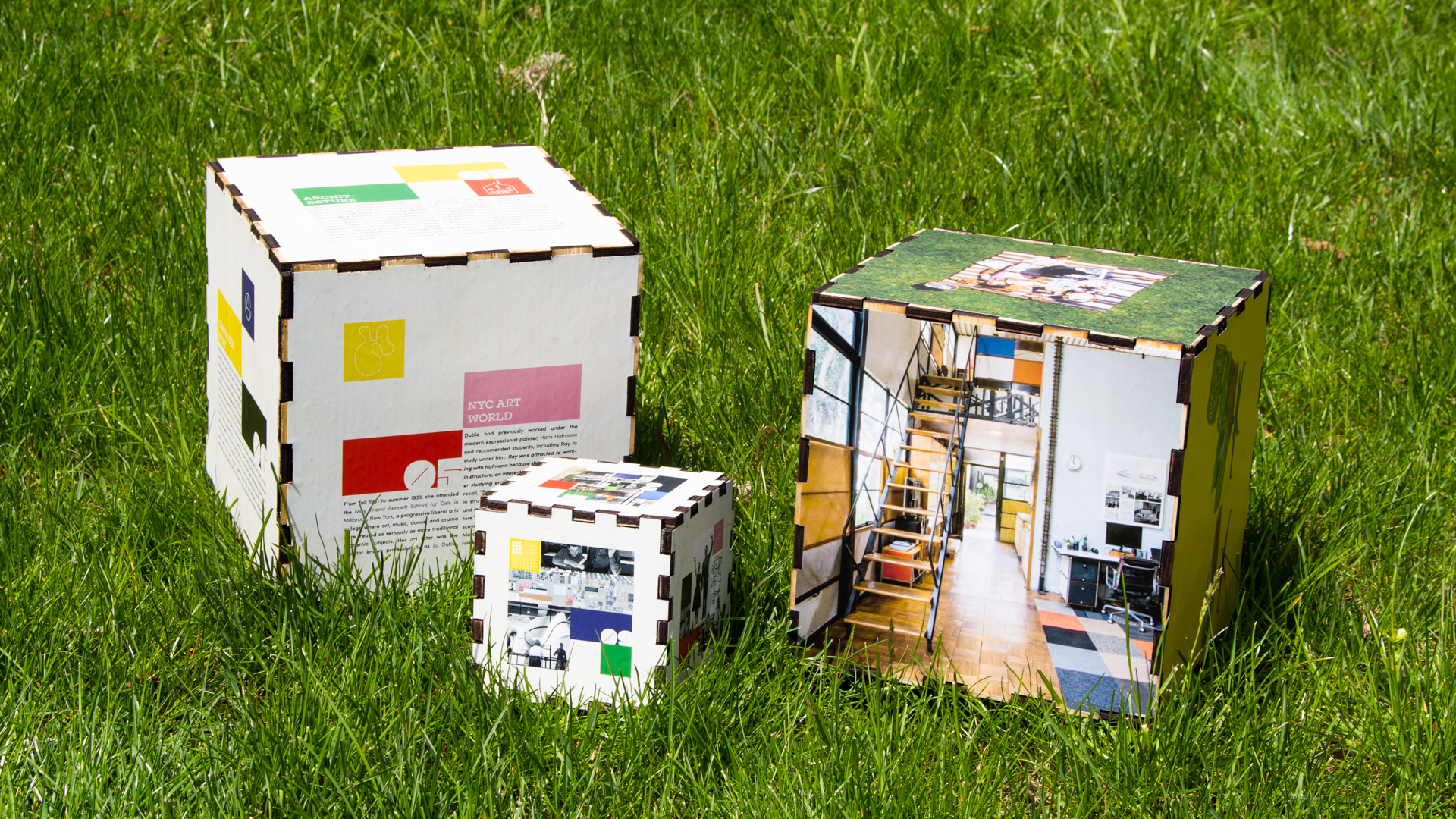
An Interchangable and Biographical Quirkly Plywood Puzzle
Created as an ode to the king and queen of mid-century modern design, Charles and Ray Eames. The cubes act as a visual decorative and playable piece to house research about the dynamic due and to document their history of art and design through an immersive and interactive format.
I took influence by the Eames‘ love of geometry and mathematics, primary colors, plywood, toy design, and customization to inform my design.
+ EXPLORE MORE
02 -- SPACE 150 VERSION 51
BRANDING, WEB DESIGN, MIDJOURNEY INTEGRATION
D 08-2023
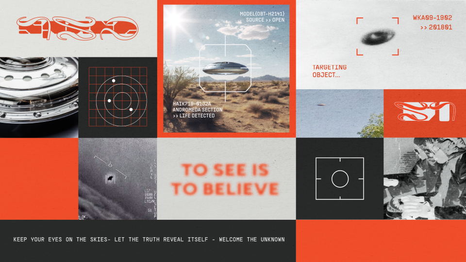
A Techy Alien Conspiracy Brand Refresh
As part of my summer internship working at space150, the intern team was tasked with creating the 51st ‘version’ ; a company wide identity rebrand that occurs every 150 days.
An ode to Area 51, V51 is where space150 tech meets human curiosity to prove the existence of alien life. Inspired by the government whistle-blowers and the over-saturation of low quality images, we sought out to use AI and create a platform where images can be sharpened and conspiracies can be proved.
+ EXPLORE MORE
03 -- HALFWAY MOTION VIDEO
MOTION DESIGN, LYRIC VIDEO, AFTER EFFECTS
D 02-2022
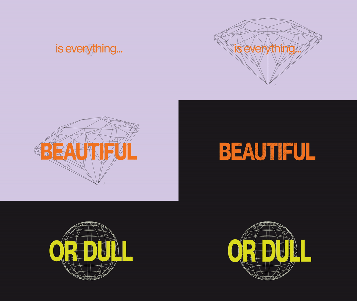

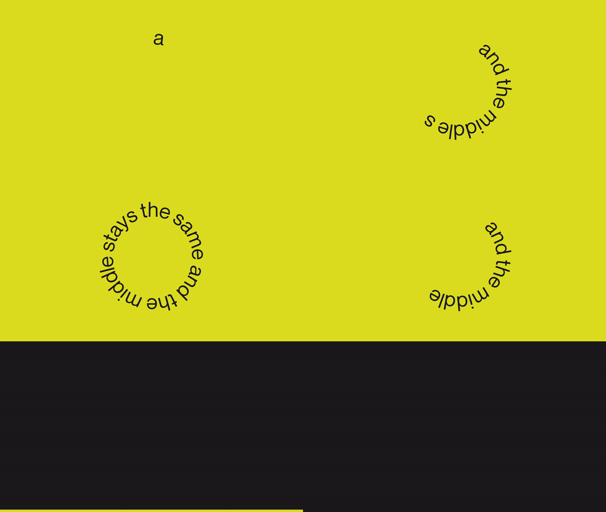

An Unoffical 8-Bit Flashy Lyric Video
This project is an unofficial lyric video created for the band Magdalena Bay. Using the song Halfway, off their debut album Mercurial World, I aimed to create a fun and retro feel to accompany the electronic, trippy, and nostalgic vibe of the music.
By including geometric wireframes, pixelated text, typing cursor animations and flashing transitions that go along with the beats of the music, I was able to create a dynamic eye catching result that matched the vibe of the song as well as the artists internal branding and style. All animations were created in after effects, including the 3D wireframes.
+EXPLORE MORE
04 -- THEORY OF EMOTIONS
EXPLORATORY PRINT, LAYOUT, PUBLICATION
D 03-2021

A Cathartic Activity Book
Inspired by the 4 core emotions of Anger, Sadness, Fear, and Joy, the Theory of Emotions Kit is a series of interactive books to help you work through all the emotions you might feel but have never known how to define.
Sourcing nouns from obscure dictionaries as well as other languages, we identified unique emotional feelings and set to create a workbook that helped you to understand them. A set of gradients connects the dots between each definition guiding you through a complete emotional journey from beginning to end. Each word involves a specific activity allowing the user to process their feelings through action.
Sourcing nouns from obscure dictionaries as well as other languages, we identified unique emotional feelings and set to create a workbook that helped you to understand them. A set of gradients connects the dots between each definition guiding you through a complete emotional journey from beginning to end. Each word involves a specific activity allowing the user to process their feelings through action.
+EXPLORE MORE
05 -- ZUG ISLAND
MOTION DESIGN, RESEARCH, EXPLAINER VIDEO
D 04-2022
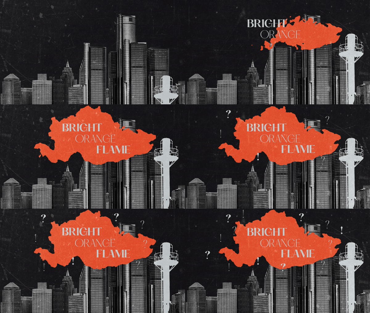
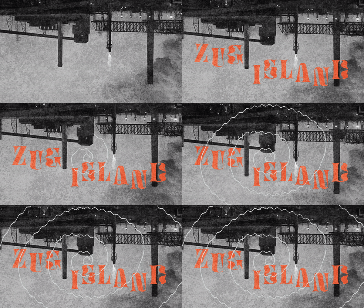
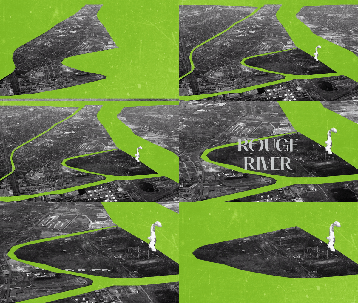
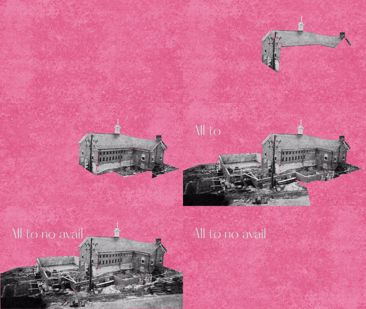
A Flashy Historical Retelling
This project is an explainer video on the history of Zug Island in Detroit, Michigan and it’s ominous beginnings as well as the lasting effects of its pollution on it’s neighboring communities. I was inspired to research this topic after discovering a mysterious never ending flame outside my dorm room window.
I attempted to capture the grungy danger of the island by adding textures and sharp cut collages that pieced together to show the historical context.
+EXPLORE MORE
06 -- DeEP
BRANDING, SYSTEMS DESIGN, SPONSORED PROJECT
D 11-2022
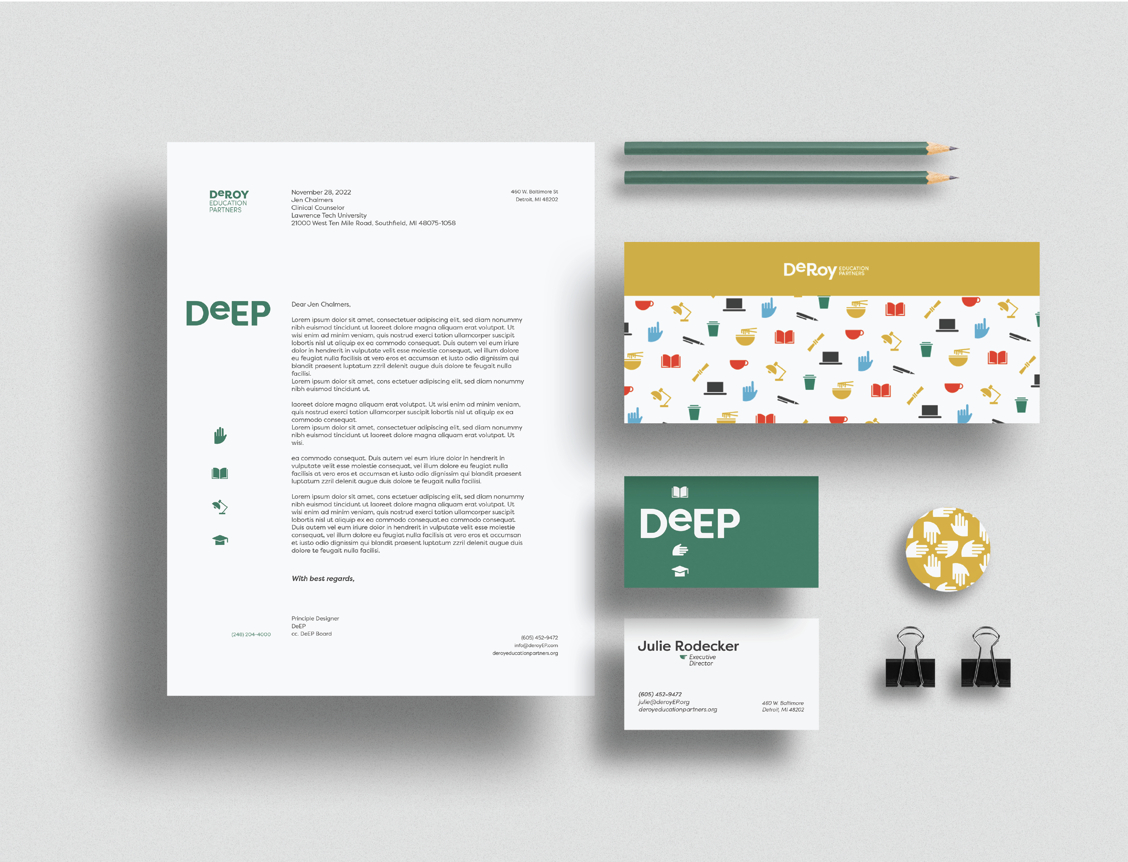
A Young and Relatable Branding System
In the fall of 2022 the DeRoy Education Partners launched their DeEP fellowship program targeted towards first generation college students, as well as sophomore and juniors who were feeling educational burn-out or wanted to gain a sense of community at their university. The scholarship opportunity allows students to receive financial assistance as well as as career and class coaching, volunteer experience, and a cohort of fellow students to bond with.
The board committee came to CCS to find their brand identity through a sponsored studio, where myself and my team of Mariana Matos, Madison LaLonde, and Brenna Potter presented them with our concept. We focused on the camaraderie, connections, and support DeEP could provide it’s students.
+EXPLORE MORE
07 -- LE PUZZ
MOTION DESIGN, LYRIC VIDEO, AFTER EFFECTS
D 10-2022

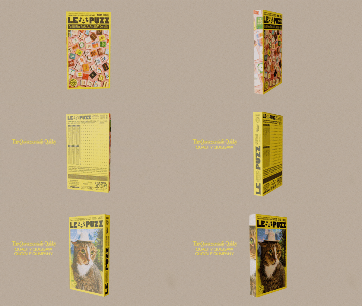
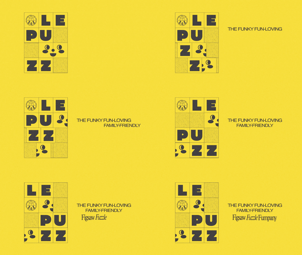
A Quirky Fun Loving 3D Advertisment
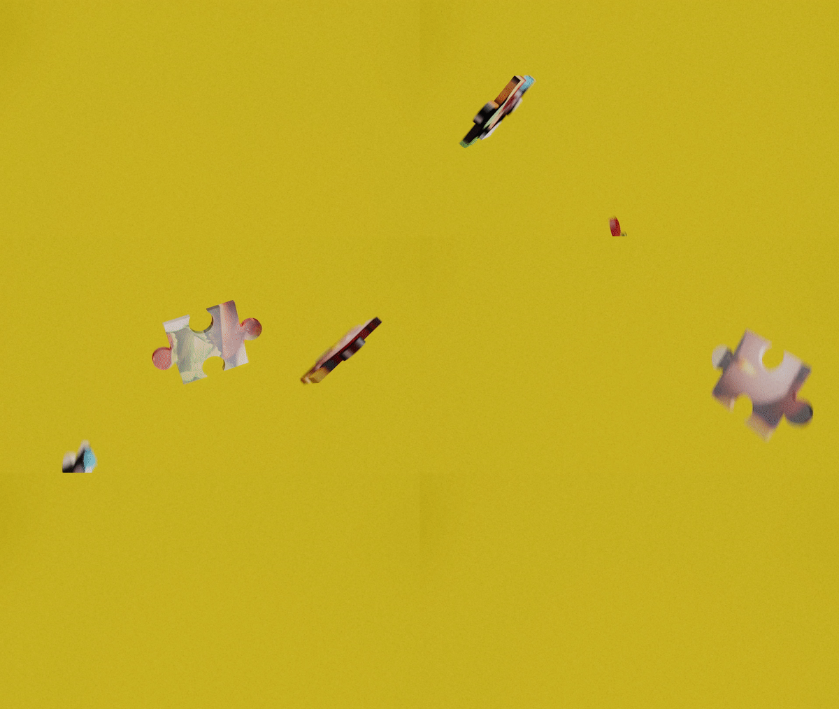
This project is an unofficial campaign video created for LePuzz Puzzles. As an avid fan of their brand imagery and products, I used their messaging and design principles to practice my animation skills in Cinema 4D. I modeled a spinning and shifting version of their puzzle box and covers as well as some puzzle pieces jumping and falling to create excitement. The video was created in combination with after effects for the 2D elements and editing, the result is a quick, bright and punchy advert for the funky fun-loving puzzle brand.
+EXPLORE MORE
08 -- GNOME SCOUTS
BRANDING, SYSTEMS DESIGN, LITERACY CENTER
D 11-2021

A Whimsical Nature Loving Branding System
826 National is a non-profit dedicated to promoting literacy and tutoring services to children across the United States. Each location also features a retail space themed around the city and state in which it is located.
826 Oakland Gnome Scouts acts as a fictonal exploration of what an 826 store could be if located in Oakland California. Inspired by the city’s hisory of social justice, advocacy, and community as well as the natural landscape of the redwood forest and the mysterious culture of gnome street art paintings. 826 Oakland serves as a whimsical network of neighborhood advocates and scouts looking out for the underdog and learning how to help their community and planet along the way.
+EXPLORE MORE
09 -- FORGOTTEN HARVEST
BRANDING, SIGNAGE, SPONSORED PROJECT
D 04-2022

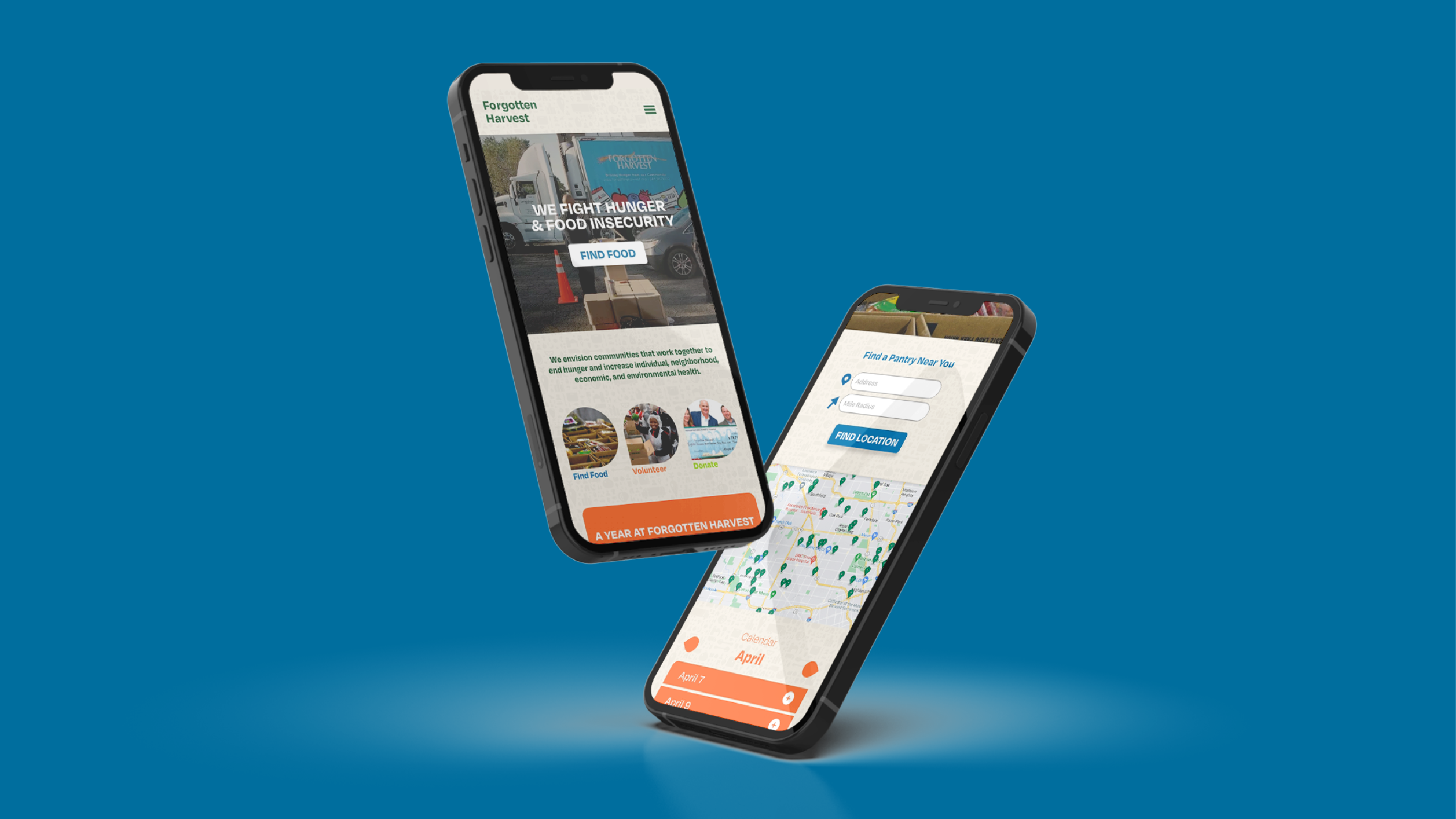
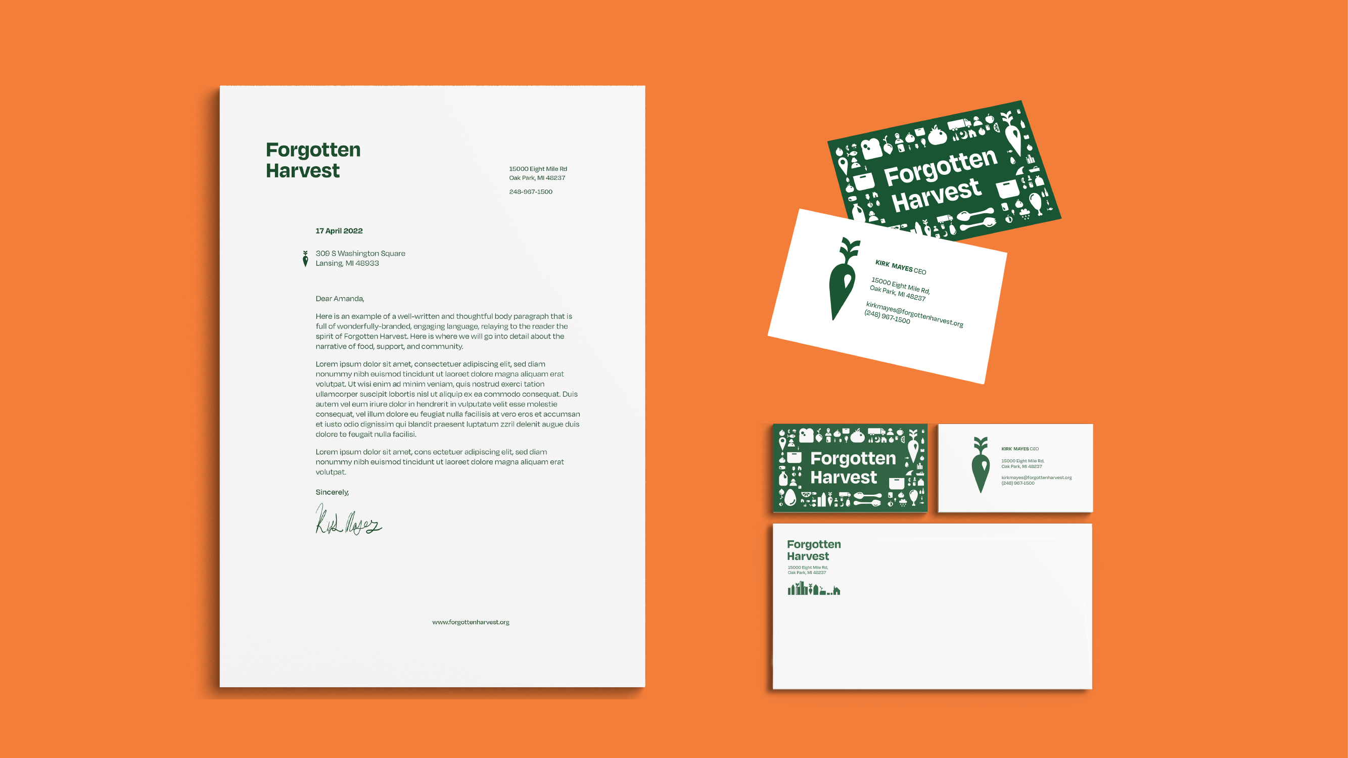

A Bright and Healthy Brand Refresh
Forgotten Harvest is a local non-profit food distributor that rescues food waste and delivers 144,000 pounds of surplus food per day, providing families in need with fresh and nutritious food free of charge. They are the one of the largest non-profit organizations in Metro Detroit and despite their great history and recognition, they possessed an outdated and disjointed brand identity. Sponsored by Mercedes Benz Financial Services, I was chosen along with a team of 6 other designers to research food waste, food insecurity, and the impact of Forgotten Harvest in order to design a complete rebrand of their identity.
+EXPLORE MORE
10 -- BEAN SPROUTS
PUBLICATION, RISO PRINTING, POETRY
D 10-2022

A Set of Poems and A Side Hobby
Inspired after taking a poetry writing workshop, I designed, and printed this chapbook with 12 original poems written over the course of 5 months using all of my own photography, art, printings and color separations to accompany them. Each poem has its own spread with an original piece of artwork and bright risograph inks. A mix and match of photos, illustrations, and collages they each pay omage to lines and phrases in the poems
+EXPLORE MORE
11 -- SUMMIT SANS
TYPEFACE DESIGN, GLYPHS
D 05-2023


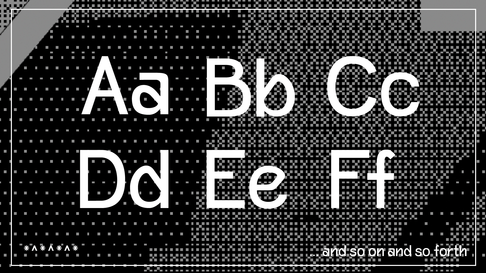
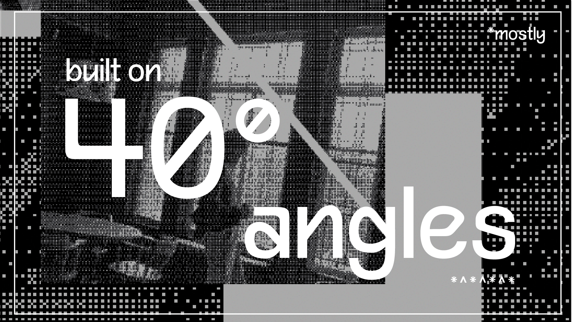
A Geometric New Age Sans Serif
During my final semester of college I was able to take a typeface design class that allowed me to explore the wonderful program that is Glyphs. Thus Summit Sans was born, a quirkly angled bauhaus inspired sans serif. Influenced by the concept of movement upwards and onwards in both my own personal life and the world around me, the letterforms are all largely based upon the 40 degree angle and create funky sloped effect.
+EXPLORE MORE